
Supply & Demand: the One Diagram Behind Every Price
Two crossing lines explain why almost any price is what it is — and which way it moves next.
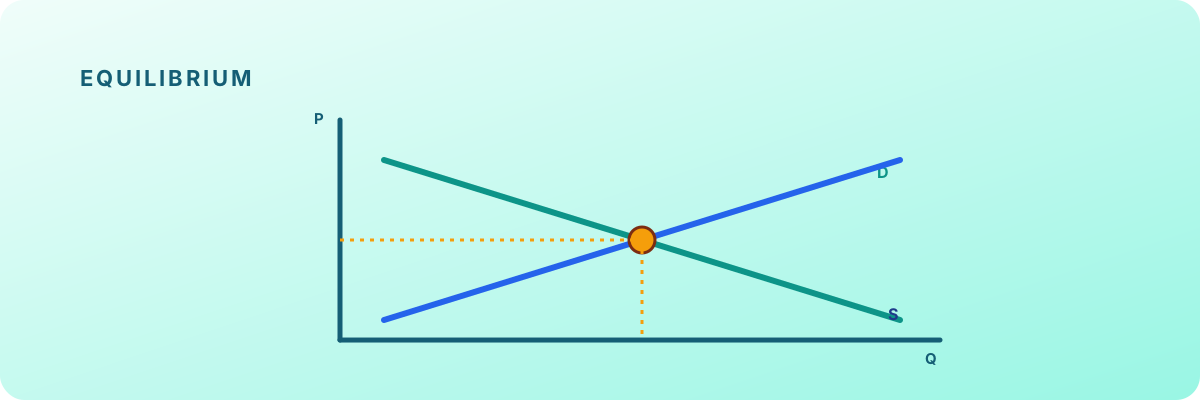
Two forces, one crossing point
Think about buyers: the cheaper something is, the more people want — so the demand line slopes down. Now sellers: the higher the price, the more they're willing to produce and offer — so the supply line slopes up. Put both on the same chart and they cross at exactly one point.
That crossing is the equilibrium — the price where the amount buyers want equals the amount sellers offer. Above it there are too many sellers (price drifts down); below it too many buyers (price drifts up). The market keeps getting pulled back to the cross.
Reading real-world moves
This one picture explains a huge amount of financial news. A frost hits coffee crops (supply falls) → coffee prices rise. A popular company posts great results (demand for its shares rises) → its stock price rises. You don't need to memorise outcomes — just shift the right curve and read where the new cross lands.
Check your understanding
- Demand slopes down (cheaper → more wanted); supply slopes up (pricier → more offered).
- The equilibrium price and quantity sit where the two curves cross.
- More demand → price and quantity rise; more (cheaper) supply → price falls, quantity rises.
- It's a model for reading the direction of price moves, not a prediction tool.