
Markets Course 🕯️ Reading Price Charts
⚖️
Educational content only — not financial, investment, trading, tax, or legal advice, and not an inducement to buy or sell anything. Examples and figures are illustrative, use hypothetical data, and are not predictions. Independent educational material; third-party names are used descriptively and imply no affiliation.

How to Read Any Price Chart in 5 Minutes

Every price chart is built from one simple shape. Learn it once and you can read them all.
BeginnerNo finance background neededInterview foundation
💡
The big idea: A candlestick chart looks intimidating, but each candle encodes just four numbers — the open, high, low and close for a slice of time. Once you can read one candle, you can read a whole chart. You'll build one by hand below.
🎯 By the end, you'll be able to
  • Name the four prices every candlestick shows
  • Tell a rising (bullish) candle from a falling (bearish) one at a glance
  • Read a short sequence of candles as a story of the price
  • Explain why a chart shows what happened — not what will happen next

A chart is a picture of a negotiation

Strip away the colours and the jargon and a price chart is simply a record of buyers and sellers agreeing on prices, moment after moment. The most common way to draw that record is the candlestick — and it packs a surprising amount into one little shape.

Here's the whole trick: each candle summarises four prices for one slice of time (a day, an hour, a minute). Learn those four and the rest is easy.

🔑 The four prices in every candle
Open — the price at the start of the period. Close — the price at the end. High — the highest it reached. Low — the lowest it reached. The thick body spans the open and close; the thin wicks reach up to the high and down to the low.
High 118 Open 100 Close 112 Low 94 Green body: price closed higher than it opened
One candlestick, fully labelled. The body runs from the open to the close; the wicks mark the extremes reached along the way.

Green means up, red means down

Colour tells you the direction at a glance. If the price closed higher than it opened, the candle is drawn green (bullish). If it closed lower than it opened, it's red (bearish). That's the entire colour rule — and you can feel it in your hands in the next panel.

🎮 Build a candle: drag the close LIVE
Grab the Close handle and drag it up and down. The moment the close drops below the open, the candle flips from green to red — the price 'gave back' its gains. You just controlled a candlestick.

From one candle to the whole chart

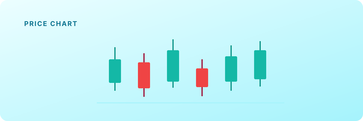
String candles together and you get the story of a price over time. A run of green candles making higher highs is an uptrend; a run of red candles making lower lows is a downtrend. Long wicks show prices that were tested and rejected. Read the sequence below left to right like a sentence.

97 104 110 117
Five candles telling a story: buyers mostly in control (four green, one red), each pause followed by a push to a higher high — an uptrend.
📝 Worked example: A daily candle shows: open 50, high 57, low 49, close 55. Is it bullish or bearish, and how long are its wicks?
  1. Compare close to open: 55 > 50, so the price closed higher — it's bullish (green).
  2. The body runs from the open (50) to the close (55).
  3. Upper wick = high − top of body = 57 − 55 = 2. Lower wick = bottom of body − low = 50 − 49 = 1.
✓ Bullish, with a 2-point upper wick and a 1-point lower wick.
⚖️ Reading is not predicting
A chart tells you what already happened — it is not a crystal ball. Being able to read candles helps you understand the past and follow a conversation about markets; it does not tell you what a price will do next, and nothing here is a recommendation to buy or sell anything.

Check your understanding

1. A candle has open 20, high 26, low 19, close 24. What colour is it?
Close (24) is above open (20), so the price closed higher — a green, bullish candle.
2. In a candlestick, the thin lines sticking out of the body are called…
The wicks (also called shadows) reach up to the high and down to the low; the thick part is the body, spanning the open and close.
3. A red candle means that, over the period, the price…
Red simply means the close was below the open — it 'gave back' ground by the end, regardless of what happened in between.
4. The TOP of a green candle's body marks the…
For a green (bullish) candle the close is higher than the open, so the close sits at the top of the body. (The high is the top of the upper wick.)
5. What can a candlestick chart reliably tell you?
Charts record the past. They're a way to read what happened — not a prediction, and not advice.
✅ Key takeaways
  • Every candlestick encodes four prices: open, high, low, close.
  • The body spans open→close; the wicks reach to the high and low.
  • Green = closed higher than it opened (bullish); red = closed lower (bearish).
  • A chart shows what happened, not what will happen — reading is not predicting.
⚖️
Educational content only — not financial, investment, trading, tax, or legal advice, and not an inducement to buy or sell anything. Examples and figures are illustrative, use hypothetical data, and are not predictions. Independent educational material; third-party names are used descriptively and imply no affiliation.